
Introduction
As web developers, we should pay closer attention to how we structure our HTML and what type of attribute we're adding. By doing small changes, we can achieve great results without a lot of effort.
You don't have to be an accessibility expert to understand good practices. A well-organized website with optimized content can dramatically improve your website's ranking in search engines without hiring an SEO consultant.
Why do we care about accessibility in the first place? Well, because we want our site to be visible in search engines and easily found by our target audience. Accessibility is about making our site is usable for everyone.
But that's not the only reason. There are around 15% of the world's population, experience some form of disability, according to the World Health Organization. That's a giant number of people that we can reach if our site is accessible.
By making our site more accessible, we also make it usable for everyone. That's what defines the success of the website. When it's usable for everyone, it will get more audience. More audience means more customers, and more customers mean more money.
If it sounds complicated for you, don't worry. It will make more sense as we go. I promise.
Tip. In this article, I'm going to use the word “website”. That includes WordPress themes, plugins, applications, and everything else that can be accessed on the internet. For example, an admin panel which is used by a group of people to manage a website or an application can be considered a web resource.
Website accessibility basics
Web accessibility means that websites, and other web resources are designed and developed so that people with disabilities can use them effectively, independently, and with confidence. In simpler terms, the website should be accessible for everyone.
People must be able to perceive the content, understand it, navigate without issues and interact effortlessly with the site. I'm not going to be able to discuss everything you need to know about accessibility in one article.
First, I don't know everything about accessibility because that's not my main focus. My main focus is web development in general. There are some fundamental concepts about accessibility that I'm still exploring.
Second, there is a good deal of information about accessibility on the internet. There is even a Web Content Accessibility Guidelines (WCAG) 2.0, which was published by the World Wide Web Consortium (W3C) that describes everything in details. You can read these Guidelines if you need to go more in depth on accessibility. But for now, I'll be sharing my experience and some practical tips to help you get started.
How accessibility improves SEO
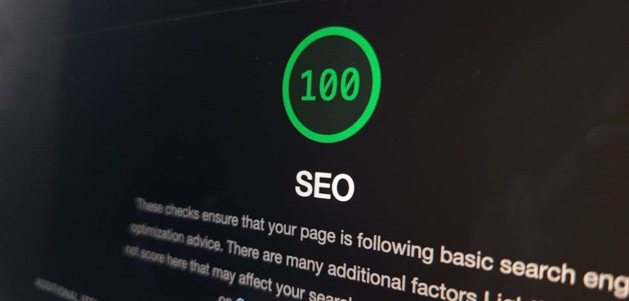
As you can see, accessibility and SEO go hand in hand. Improving accessibility we improve our SEO. The goal of SEO is to improve the visibility of our site in search engines. Accessibility is one of the most important factors that influence SEO.
For example, Google uses many factors to determine the ranking of the website. And accessibility is one of them, along with the web page loading speed and content quality.
SEO and accessibility is a bit more than just proper HTML tags on the page. But, for the most part, it starts with the proper HTML structure and correct attributes. Of course, there are other critical factors, but we will talk about them in a different article.
Our main focus will be on HTML structure and attributes, which in my opinion is the most significant part for accessibility. In this article, we'll see how we can make our site more accessible and, as a result, improve SEO.

Mainly, I will be focusing on SEO for Google search engine, but all of these techniques can be applied to any search engine, including DuckDuckGo and Bing. Even less popular search engines would benefit in the same way from these simple techniques, which any web developer can implement in a new or existing project.
Who am I to talk about accessibility?
You might be curious, who is this gentleman to talk about SEO and accessibility? Should I trust him? What if this information is misleading? Well, I can sure you, it's not.
My name is Serhii, and I am a web developer who was always interested in web app optimization, accessibility, and SEO since I've started working as an IT-specialist in the company based in the Netherlands.
It was a product company with the primary focus on business and legal services. And my job was to develop new products with Laravel and support old WordPress products. And luckily for me, the old products were not well optimized and had a lot of technical debt.
It was a great chance for me to learn how I can improve performance and make products more SEO friendly and accessible for users, even though no one has told me to do that.
Many techniques I've implemented in my projects are simple and useful for web developers. That's why I want to share the information I've learned with you so that you can benefit from it as well and hopefully share this post with others.
If you would like to know more information about me, feel free to visit the about me page.
Screen readers and accessibility
Before we delve into the main topic of how to make your website more SEO friendly, I want to talk about screen readers and web accessibility. Trust me, it will make sense in the end.
A screen reader is a software application which simply reads text on the screen. It's mainly used for people with vision impairments, but I frequently use it myself to check the article after I finished writing it. It helps me to proofread the content that I've written to catch some typos or errors.
Recently, I've started using the built-in reader in the Firefox browser because it's very convenient.
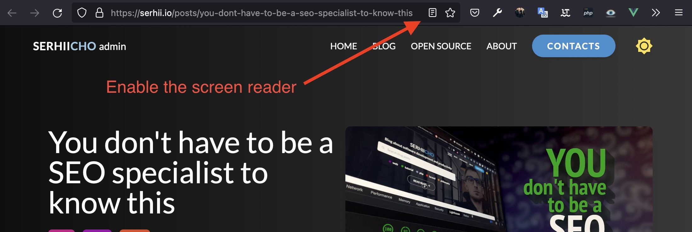
I can just hit a Reader View button, and the post will start reading from the beginning. It really helps me because I spend too much time in front of the computer, and my eyes can finally rest when I'm going through some interesting article.
Why am I even talking about screen readers in the article? Well, because screen readers help to increase your site's accessibility, and accessibility is rated highly by search engines like Google.
I don't need to explain to you why the accessibility is so important because it is only going to distract us from the main topic of this article. But if you really want to get more familiar with accessibility and why it is so significant, I can recommend an article from the SEO company Moz. The link to the article will be down below.
In short, making your website accessible is not only good for the people with disabilities, but also for rankings. We will look at some tips and tricks on how to improve your website's accessibility in just a bit, for now, let's just remember that it's vital.
To summarize, screen readers are significant for SEO because they help to make your website more accessible. And accessibility is one of the most critical ranking factors for search engines, especially for Google.
So, let's think, what can we do to make websites more accessible and screen-reader friendly?
Proper heading tags
Heading tags is probably the most important thing you want to focus on when trying to make your website more SEO friendly.
The simple rule of thumb is that you aim to have one H1 tag on the page, and it should be at the very beginning of the page. Meaning, when a browser reads an HTML page from top to bottom, the first heading tag it should see is the H1 tag.
The H1 tag should have the most influential title for the page. So, if you have a blog post with the title “Telegram bot with Laravel”, your H1 tag should be like this:
<h1>Telegram bot with Laravel</h1>After, you can use as many H2, H3 or H4 tags as you want, but you want to make sure that every H2 tag comes after the H1 tag in your HTML. The same applies to other tags, every H3 tag should come after the H2 tag.
It is critical because, without a proper hierarchy, screen readers will have a hard time understanding the content and will have to guess the hierarchy. It will result in a lower position in SERP (Search Engine Results Page). That's undoubtedly what we are trying to avoid.
Take a look at the example of proper structure of the HTML headings:
<h1>Telegram bot with Laravel</h1>

    <h2>Introduction</h2>
        <p>Some text here…</p>

    <h2>Create a chatbot</h2>
        <h3>Telegram BotFather</h3>
            <p>Some text here…</p>
        <h3>Setup configurations</h3>
            <p>Some text here…</p>
        <h3>Writing our first bot</h3>
            <p>Some text here…</p>

    <h2>Conclusion</h2>
        <p>Some text here…</p>
The indentation here is just for reading purposes. You can structure your HTML headings as you want, just make sure they are in a proper hierarchy.
If you want to check the accessibility of any website, there is a great and free tool out there called the WAVE Web Accessibility Evaluation Tool. You might want to check it out.
It will show you everything that you might want to fix or improve on your website to make it more accessible. Take a look at the example of the home page of this site:

The WAVE inspection result might seem a bit overwhelming at first, but it's actually a great way to find all the important information you might not see at first glance.
That's all about heading tags for now, I can talk about it more in-depth some other time. If you still want to know more about it, here is the link to MDN web docs, where they talk about heading tags in more details.
Attribute tabindex
The tabindex attribute can be added to almost any HTML element, but usually, you want to add it to anchor tags. This attribute allows you to control the order in which your website's elements will be focused when a user presses the Tab key on the keyboard.
It can have a positive or negative number as a value. If the number is positive, let's say 3, it will be focused after the element with value 2. If tabindex is 1, it will be focused after the element with index 0. Pretty simple and straightforward.
When the value is negative, often it's -1, it means that the element will not be focused at all. I typically use it for buttons that open and close modals, or site logos.
I do not want the screen reader to focus on it every time I press the Tab key, so I set tabindex="-1". Here is the example of my logo on the navigation bar:
<a
    tabindex="-1"
    href="{{ route('home') }}"
    class="text-lg font-bold transition-opacity hover:opacity-80 text-lato drop-shadow-[1px_1px_0_rgba(0,0,0,.4)]"
>
    <div class="tracking-wide">
        <span class="text-white">SERHII</span>
        <span class="text-main-light">CHO</span>
    </div>
</a>
Because I have the negative value, I get focus on the first navigation link after pressing the Tab key.

But if I change the tabindex from -1 to 1, refresh the page and press the Tab key, I'll get focus on the logo and not the first navigation bar link.

Of course, the tabindex is not so necessary as heading tags for SEO, but at least you should be aware of its existence and how it works.
Adding the tabindex attribute to your HTML anchor elements will help screen readers to navigate through your website more easily.
Attribute area-hidden
We often see aria-hidden="true" attribute added to icons and other decorative elements. It means that this element should be hidden from screen readers.
Some people say that it's not necessary to use aria-hidden attribute because modern screen readers can detect decorative elements and skip them. But I still prefer to add it, just in case some older screen reader will not be able to do that.
Because there are people with motor difficulties who rely on using a screen reading program or keyboard to interact with the content on the page. And not all screen readers are up-to-date.
<i class="lni lni-chevron-down" aria-hidden="true"></i>I usually add this attribute to icon and decorative elements to hide them from screen readers to improve accessibility.
Attribute area-label
One of the important attributes for SEO is an area-label. It allows you to give a brief description of a non-textual element for screen readers. Here is a good example:
<button type="button" aria-label="Clear filters">
    <i class="lni lni-close" aria-hidden="true"></i>
</button>
This button doesn't have a text, it has an icon — close. To describe it to a screen reader, we add the area-label attribute with the label “Clear filters”.
Tip. When you put text into aria-label attribute, don't include the name of the element in it. In the example above, instead of writing “Clear filters button” I just wrote “Clear filters”. This is considered better for SEO.
You don't need to add aria-label attribute to elements that have a text content. For example, a button with the text “Close all tabs” doesn't need an aria-label attribute because it already has a text.
I always add aria-label attribute to all interactive elements that have an icon or image inside.
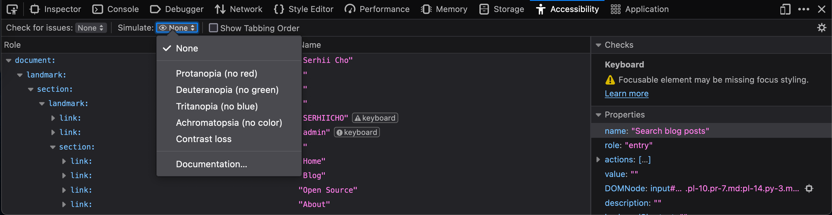
Accessibility tab on Firefox
You can turn on the “Accessibility” tab on the Firefox browser. This will show you useful information about your website in terms of accessibility.
You can even choose to view your page as a person with vision impairment.
Firefox is very underestimated, it's a cool browser that can make your job as a web developer easier with their built-in tools and the add-ons available in the store.
Color contrast
You should use contrast between the text, and its background color with high contrast to make it easier to read for people with low vision.
Based on Web Content Accessibility Guidelines (WCAG), the recommended contrast ratio is 4.5:1. For the large text, the ratio can be 3:1.
Tip. The Contrast Ratio is the difference between the brightest color and the darkest color.
If these numbers don't give you any hint about what you can use, you can use a color contrast tools like WAVE Web Accessibility Evaluation Tool, which I've mentioned earlier in the post. WAVE will check the color combinations and show you the exact places where you need to make changes.
I was using incorrect color ratio as well on my blog post tags. Here is the screenshot of the post tags with bad and good color ratios:
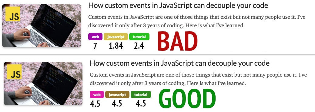
Numbers under the tags represent the contrast ratio between the font, and its background color.
These 2 post items look pretty fine for most of the people, but we should remember that the color contrast ratio of people with visual impairments is a lot smaller.
You can use contrast-ratio.com, it will be helpful when you need to check the numbers for any color combination. I will use this site in the future to make sure I avoid making the mistakes like this on with tags.
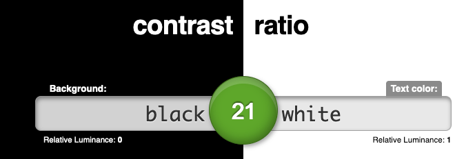
This is the contrast ratio between black and white colors on contrast-ratio.com. As you can see, 21:1 is the maxim contrast ratio between 2 colors. Of course, you can use any colors you want on your website, just try not to go below 4.5:1 and above 20:1. That's generally a safe margin.
Conclusion
In this article, we saw different ways to make your website more accessible and SEO friendly. There are a lot more attributes that I haven't mentioned in this article, like role, alt, aria-labelledby, and others. If you want to go more in depth on creating accessible and SEO-friendly websites, you can find numerous resources on the Internet on this topic.
One of the best resources that I've found is mozilla.org. They have plenty of tutorials and articles on SEO, and how to make your website more accessible.
Remember that adding HTML attributes is not the only way to make a website more accessible. As we saw, the contrast ratio is also playing a massive role in determining whether your users can perceive the content on your website or not.
When you get more in depth into this topic, it can get really overwhelming. I would recommend taking things one step at a time, and do not try to do everything at once. Don't worry to make everything perfect immediately because it's not going to be. It's very difficult to make a website fully accessible, unless it's a brand new one without any previous code on it.
Moz article: SEO and Web Accessibility: What You Need to Know
Keywords: google, wcag, contrast, firefox, tabindex, area-hidden, area-label, tags, frontend, sitechecker